Best for
Poster layouts, product launch banners, branded ad creatives, and multilingual marketing visuals.

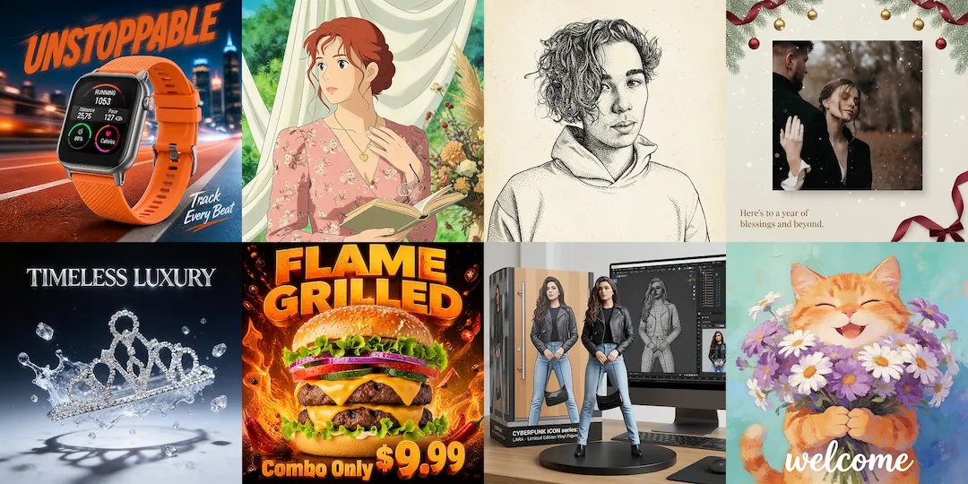
Seedream 4.5 is a strong fit for visual work that mixes image quality, layout logic, and readable text. If your output needs to feel closer to a poster, ad creative, product banner, or branded campaign visual, this is one of the more interesting models to test first.
Best for poster and ad creative work
Useful for readable text and hierarchy
Strong fit for campaign-ready design output
At a glance
Poster layouts, product launch banners, branded ad creatives, and multilingual marketing visuals.
Stronger composition logic, clearer typography, better use of hierarchy, and more design-oriented output.
If you only need quick rough ideation, a faster general model can still feel lighter and more efficient.
Your brief depends on ads, landing-page visuals, posters, or brand assets that need to communicate with text and layout.
Best fit
Many image models can make attractive pictures. Fewer feel genuinely useful once the task depends on hierarchy, poster composition, and readable copy. Seedream 4.5 becomes a stronger option when the work needs to communicate as clearly as it looks, especially for ads, product banners, event posters, and branded campaign assets.
Before you use it
Seedream 4.5 is most convincing when the image needs structure as well as visual quality. If you are still exploring a vague direction and only need many loose variants, another model may feel faster. When the brief depends on poster logic, campaign hierarchy, or cleaner text, Seedream 4.5 becomes easier to justify.
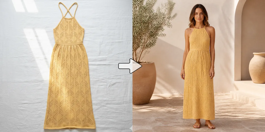
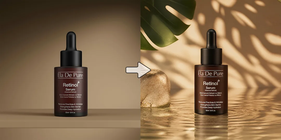
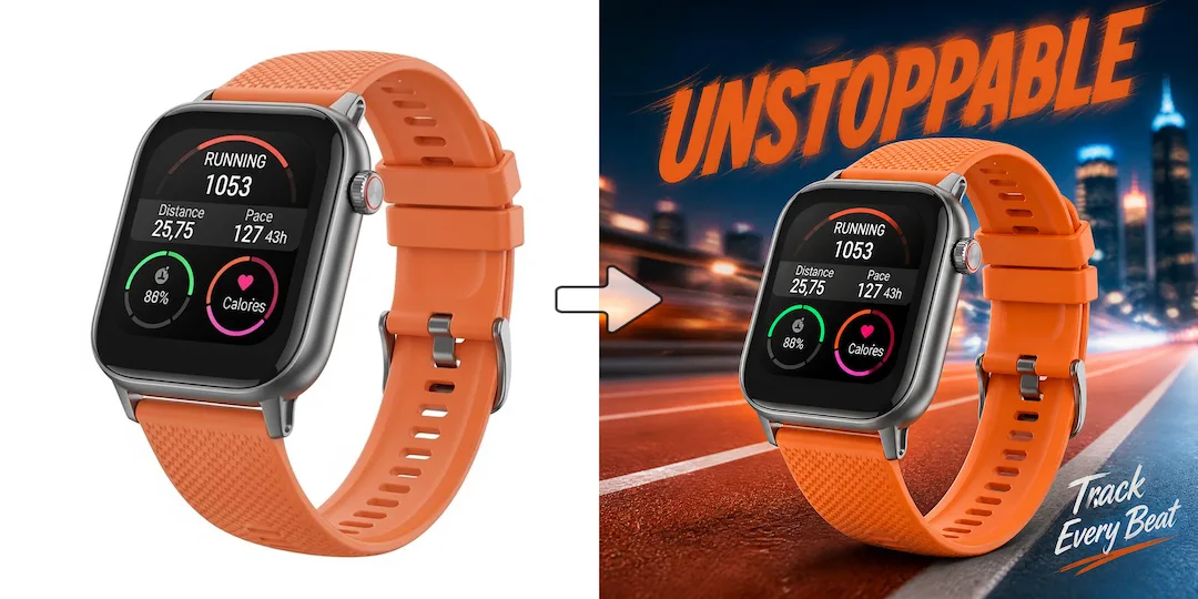
These examples focus on the kinds of design work Seedream 4.5 is especially suited to, including posters, ad creatives, product banners, and visuals that depend on cleaner typography.
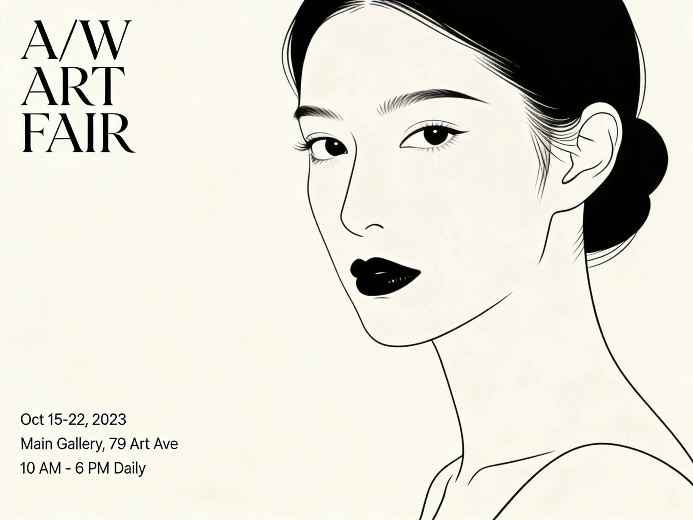
Seedream 4.5 becomes interesting when the task starts looking more like design than illustration. This poster prompt is meant to show layout discipline, white space, and small-text clarity.
Prompt used for this visual
Design a minimalist art exhibition poster on an off-white background. Place a refined black line portrait slightly right of center. Add elegant serif headline text in the top-left corner: "A/W ART FAIR". Add three lines of small readable event details in the bottom-left corner with clean alignment and generous negative space. The poster should feel like a real gallery campaign designed by a professional studio.
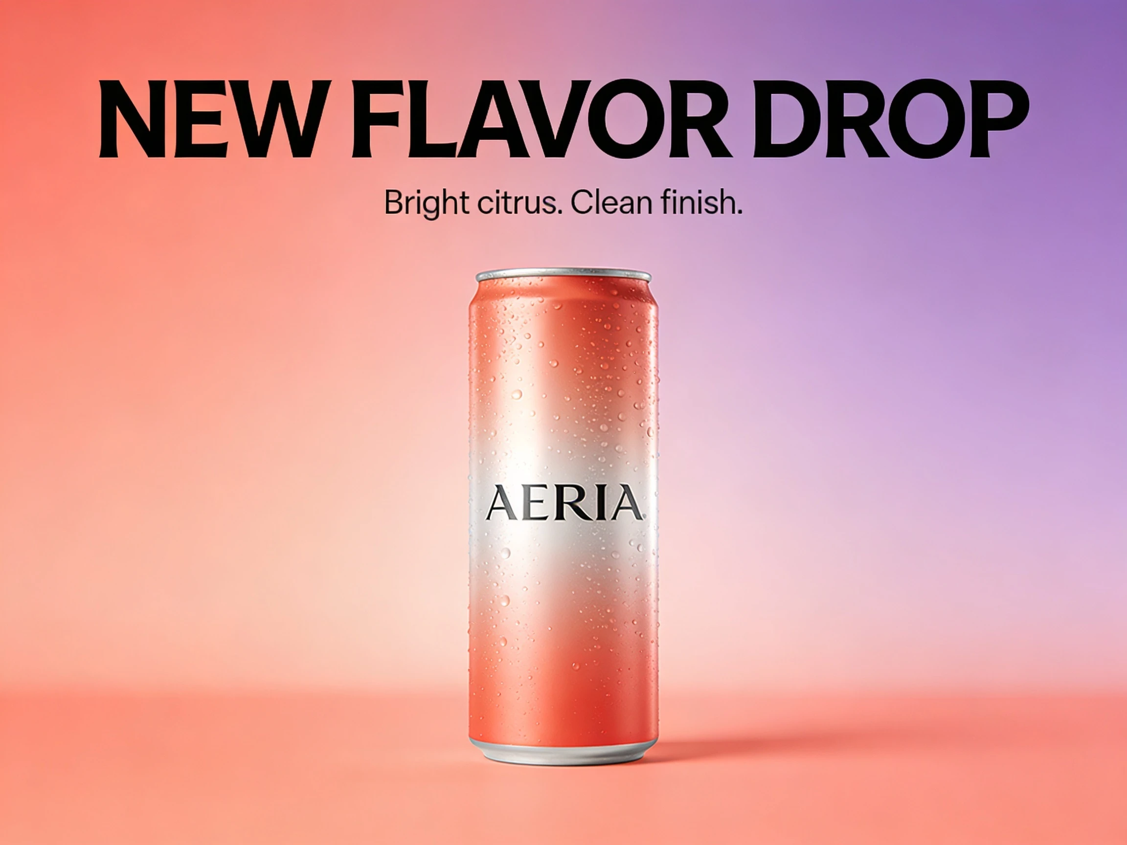
This visual is built for ecommerce and paid-social search intent. The goal is not just a nice image, but a usable ad layout with product focus, headline hierarchy, and believable brand polish.
Prompt used for this visual
Create a premium product launch banner for a fictional sparkling drink brand called AERIA. Show one can centered against a soft coral-to-lilac gradient background with realistic highlights and condensation. Add bold readable headline text: "NEW FLAVOR DROP" and smaller supporting copy: "Bright citrus. Clean finish." Use polished commercial composition, sharp typography, and balanced ad layout.
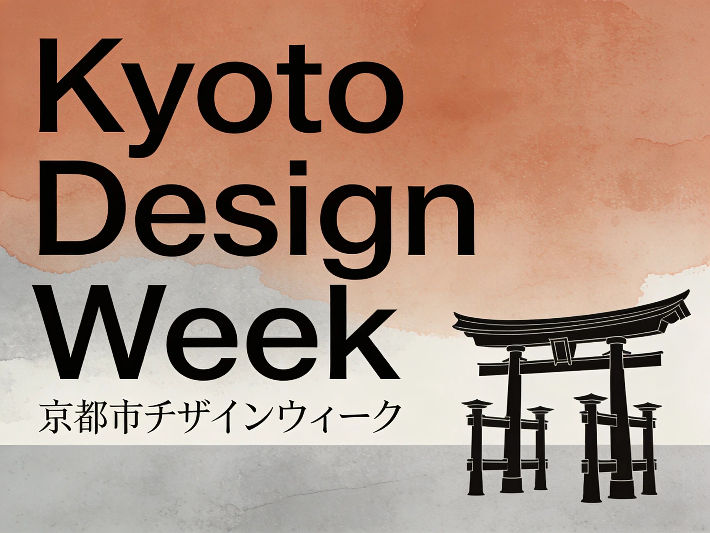
A lot of users look for Seedream 4.5 because they need more reliable text and layout across real marketing use cases. This example reflects that by combining hierarchy, multilingual type, and an editorial grid.
Prompt used for this visual
Create a clean travel poster for a fictional Kyoto design week event. Include readable English headline text "Kyoto Design Week" and a smaller Japanese subtitle beneath it. Show a calm editorial composition with modern grid layout, muted colors, refined typography hierarchy, and a polished cultural poster aesthetic. Keep all text crisp and aligned.
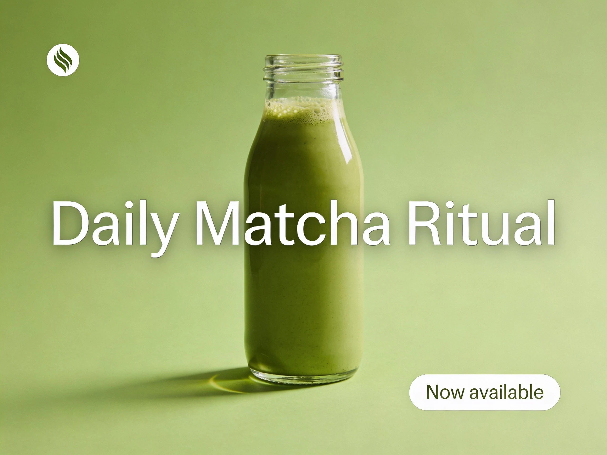
This style of image is useful for landing pages, paid ads, and storefront banners. It demonstrates where Seedream 4.5 can feel more like a design assistant than a pure image generator.
Prompt used for this visual
Create a modern social ad creative for a premium matcha brand. Show a glass bottle on a soft green background with subtle shadows, realistic reflections, and a clean product-first layout. Add readable headline text "Daily Matcha Ritual" and a small callout badge "Now available". The image should feel like a real paid social ad with strong hierarchy and restrained design.
Try Seedream 4.5 in NanoVibe and generate campaign-ready visuals for posters, paid social, product launches, and branded promotions.
Try Seedream 4.5 nowYes. It is especially worth testing when your output needs a stronger sense of layout, clearer typography, and a more obviously commercial design feel.
That is one of the reasons people look at it. You should still keep copy concise, but Seedream 4.5 is a practical option for poster headlines, short supporting text, and structured layouts.
Use Seedream 4.5 when you want a more layout-aware poster or ad creative. Use GPT Image 2 when the task depends more on photorealism, precise editing, or a more controlled general-purpose commercial workflow.
Yes. It is especially useful for product launch visuals, store banners, promotional posters, and ads that need readable copy and a more designed composition.
A stronger first stop for photoreal product visuals, precise image edits, and commercial scenes with tighter control.
Better when your workflow depends on reference images, continuity, and rapid iteration over the same subject.
Test Seedream 4.5 inside NanoVibe and compare it against other models using one prompt workflow.